Smart Client Run-Time Architecture
The Smart Client architecture is built on an infrastructure that provides the following:
- Have an application workspace
- Launch application forms
- Communicate with the server
- Manage data binding between datasets and the form’s controls at both directions.
The client side infrastructure is described by the following set of components.

Smart Client Architeture
Request/Response Manager
The request/response manager works with different communication protocols (i.e http) to submit the request from the client and to handle responses back from the server.
Application
The application object is a script level object that can perform global application tasks like posting modal alerts or expose certain functionality of the workspace.
Workspace
The workspace provides common user interface services to Forms and client side components.

Workspace and application assembly
The Workspace provides the following services:
Startup & Exit
- Serves as main entry point to application
- Handles deployment
- Handles exit, update desktop, user preferences
Desktop Services
- Loads Application Configuration metadata
- Manages multiple Applications simultaneously
- Manages main window, menus, toolbars, tool boxes, status bar and form window
- Provides Look and Feel / customizable styling for UI controls
Client Services
- Provides support for login, help, printing
- Manages background tasks
- Provides Logging, Exception handling, Operational Measurements
- Manages forms by providing services to open, close, version, etc.
- Globalization support
Workspace configuration is XML (workspace.xml). It configures numerous applications and run time parameters, such as list of available application desktops, logging, help, server configuration etc.

WorkSpace and Form Components
Form
A form is a UI object that represents a business level Form and encapsulates the native implementation of the swing form (JInternalFrame in Swing for example). A form usually contains controls and sub forms.
A form manages controls, data models, actions, sub-forms and other components that define the form. The form supports design tools by delegating content creation to a “builder” class which is generated by design tools. It provides published API for application scripting.
Sub Forms are reusable forms that can be placed within parent form
Child Forms relates multiple forms within a single flow
Form Messaging system, allows for application script to communicate with other forms
Dirty Bit Tracking tracks form-modified state
Forms can be launched in work area, in the toolbar pane (toolbar), in the toolbox pane (toolbox). A form can be launched in the main work area. A form can be launched as a modal or none modal. It is by default visible, but can be made hidden by form logic (java application). Global forms are always hidden.

Form Components
Derived Forms
A derived form is a visually inherited version of a base form. It is a subclass of the base form class. Forms can be derived for providing enhaned user experience either by targeting form variations at different groups of users, or merely improving the form layout and functionality for improved usability.

Form Visual Inheritance
Form Version Selector
The Form Version Selector provides the ability to identify the correct form version at runtime, given a form logical name. A form logical name needs to be resolved to a form class based on an expression that evaluates any run time data such as user or environment properties (practically any data such as user role, locale, context etc).
Specific version of a form can be selected dynamically using the following steps:
- Launch action defines a target logical form name to be launched
- Logical form name is mapped to physical form name
- Physical form name is then launched
- Selection criteria are specified in rule-based metadata (expressions), evaluated in order until one evaluates to true
- Rules are stored in XML files as expressions , and are edited by a design-time tool
- Rules may refer to any contextual data via Path

Version selector
Controls
Controls are UI objects that are implemented as platform neutral objects. These are Java Swing controls wrapped by additional control functionality, that provides additional features (i.e. two way binding) and insulate application code from native technology. Controls may carry metadata such as:
- Control Properties – e.g., isEnabled
- Binding metadata – how control binds to form’s data
- Validation metadata – specifies constraints
- Action metadata – defines what to do when control is “clicked”
The controls contain a rich set of UI controls which provide generic support for CRM features such as hierarchical choice lists and role based authorization (RBA). 3rd-party controls may also be used, with limitations.
Supported controls are:
Textual Controls: PercentBar, Label, TextArea TextField, ObscuredText, TextArea, Currency, Hyperlink
Button Controls: Button, RadioButton, CheckBox, Menu/ MenuItem
Time Controls: DateTime, ElapsedTime
List Controls: ComboBox, ListBox
Grid Controls: Grid, Search Grid, Grid Footer, Tree, GridTree,
Containers: CardPane, Panel, TabbedPane, TabPage
Other Controls: Browser
Search Controls: LookupButton
3rd-party controls: Any 3rd party wrapped with Smart Client functionality.
Controls provide published API for application scripting.
Data Manager
Data manager enables the application framework to work with the datasets associated with an application form. The data manager follow JDNC (Java Desktop Network Components) model, with the following enhancements:
- A Data Set consists of Data Model objects
- Each data model object contains a set of fields
- A control property can be “binded” to a data model field
- Data retrieved from server-side service request is mapped into dataset
- Data is transferred between controls and dataset, in both directions, automatically
- Data is mapped from dataset and sent to server-side service for form save or other operation

Smart Client Data Models
Dataset Features
- The dataset support Single and Tabular data models
- Data model objects store native binary data and implement a generic get/set interface, not VO-based (classes stay on server)
- Dataset provides published API for form application scripting (code should manipulate data values in model, not in UI controls)
- Support for hierarchical data models
- Virtual data model – reference to model on other form
- Support for data models published from controls
Binding Framework
The Binding Framework is the glue module that links the datasets to the controls in a form. It can be easily integrated with any component to provide binding support.
Data binding performs locale-sensitive binary-text conversions as needed between controls and model
Application events are defined for any change in data model value.
The binding framework provides the following capabilities:
- Value maps, e.g. convert values of 0 / 1 to Inactive / Active
- Property binding. Property binding allows binding a data field to a UI control property other than its value. For example, a data field value can set control property such as visibility, availability (enable/disable) etc.
- Custom handlers for ‘format’ and ‘parse’ during binding
- Trigger fields to trigger binding based on changes in multiple fields
- Custom format string to format the data if the property type is a String
- Published API for manipulation of binding properties by application code (part of Control API)
Data Communication Elements
This objects are metadata-driven inter form communication entities applicable between two forms. They provide data transfer (copy by value) and data sharing (copy by reference).
- The data transfer triggered by a specified event and contains mapping capabilities
- Data sharing is performed via declaration of “virtual data model” in the receiving form. It automatically hooked up to data model in the publishing form

Data Communication Elements
Event Manager
The Event manager enables the application layer to establish client side hooks in a technology neutral way and give the ability to execute event hooks in a super class.

Smart Client Events
Validation Framework
Validation framework is used to ensure that the user input is valid before it is sent to the server.
Caching and Global Data Manager
The cache framework provides ways to cache metadata on the client side that can be used across sessions. Global data manager provides a mechanism to store data sets that can be accessed globally across all forms.
Action Manager
Action Manager dispatches actions to event handlers and executes metadata-driven behaviors. Submit actions package the Request payload and process the Response Payload. The actions are built on Swing Action model.
An action is a form element with no run-time UI, which performs a metadata-driven action. There are different Action types for performing different type of activities; each has its own metadata format. Any “executable” control, e.g. a button (‘action controls’) can target an Action. If an Action is disabled or hidden, any ‘Action Control’ targeting that Action is automatically disabled or hidden.
Since Actions defined in a form and are considered as a form component, they have by default a local form scope (in other words, they can be directly used only by the form’s code). However, an Action may be marked “published”. A ‘published’ action name can be referenced from any other form.
Menu and toolbar controls can automatically connect to published actions in the currently active form. When an action is disabled, it automatically disables connected menu items/toolbar controls.

Action Types
- Submit Action
Submits request to the server and updates the form with response data; the data is mapped between form’s data models and server side operation (XBean) inputs/outputs (setters/getters); updated data may be auto-broadcast to other forms.
- Launch Action
Launches new form in ASCF Client workspace; data is mapped between launching form’s data models (current form) and the launched (new) form input data models.
- Bulk Action
Bulks multiple Submit actions in one server round trip, in one or more transactions, or as individual requests with no transaction, across form and its sub-forms, to possibly multiple back ends.

- Bulk Action

- Sequence Action
Executes multiple actions in a sequence, where the next action in the sequence begins after the current action is fully complete.

- Sequence Action

- Subscribing Action
A subscribing action subscribes to a target action, whose state propagates back to the subscribing action. The subscribing action executes its target when it is executed.
- Service Driven UI Action (SDUI)
The Service Driven UI Action launches forms determined by a backend UI-driving service. It uses Submit action to execute UI-driving service. The UI-driving service determines next logical form. The launch action is used to populate the next logical form name. The launch action properties may be specified by service. The Service Driven UI Action copies input data models to the launched form’s dataset. It supports data context with contained input data models. It can accept multiple explicitly defined Launch actions (one per possible next logical form) along with a default one and it dynamically creates Launch action if needed.

- Process Driven UI Action (PDUI)
The process driven UI action launches forms determined by UI-driving service in process-driven UI flow. Any arbitrary process state object can be used. The PDUI updates parent/containing forms with process state. It enables adding of reusable forms to UI flow without design time modifications:
- Allows any UI control or action in reusable form to trigger flow continuation (overloading).
- Supports parallel or sequential execution of overloaded control and dynamically created Process-Driven UI action.
- May return any data model to UI-driving service when flow is continued after the UI step.
Both SDUI and PDUI can launch the next form according to predefined fields contained in an object named ‘UiDescriptor’ returned by the server.
- Both can use any business logic as UI-driving service.
- Both do not restrict the use UI-driving service public API.
- Both action types allow the process state object to have any structure.
- For both action types, explicitly defined Launch action properties take precedence over Launch properties returned by service.
- Client Process Driven UI – Script Player
This action is used to drive a client side script player. The process that maintains the state and drives the next form to be posted is a client side light weight process. The client who runs this light weight process is Amdocs Process Manager (APM) client.
Client Application Connector
Client Application Connector (CAC) provides services to invoke, terminate and exchange data between other clients on the desktop that include windows based client like outlook, excel etc., a Java based client or a browser based client.
Upgrading AmdocsCRM Smart Client form (Part Two)
Preface
The original out of the box AmdocsCRM application quite often contains forms which deliver none-optimized user experience; these forms display too much information and lack context sensitive functionality. For certain business scenarios part of the displayed information is either irrelevant or overloaded.
These forms do not take full advantage of the rich client capability provided by the Smart Client underlying Java SWING technology.
In this two part posts I try to demonstrate how the SWING technology can vastly enhance user experience and improve usability by merely rearranging form layout and adding simple logic to it.
In part one I have demonstrated the first steps in upgrading an original, out of the box, Smart Client create case form.
I created an inherited version of the original form, created a form version selector to redirect the application to the newly created inherited form, verified the inherited form, then started to rebuild the new version by first moving all original controls to a parking lot (the ‘Unused Controls’ area), and rearranged the form layout.
Note that all the logic provided with the original form (dataset, code) is still active in the new form, but since all original controls are invisible (moved to the unused controls), I can invoke the new form but can not interact with it yet due to the hidden controls.
A new grid was defined for the root panel: One column and two rows. The single column has a predefined width size (initial form width size of 800 pixels) and will stretch itself (‘growable’) to allow it expand to the full screen width.
Assuming the minimal form height is 600 pixels, the first row was defined to an initial constant height of 555 pixels and growable to provide space for the main form area, while the lower row was defined as a fixed (none growable) 33 pixels height to provide exact space to contain the form’s buttons.
Each of the two rows was populated with a card panel UI control on which second level panels may be added. This gives the flexibility to add several fully overlapped panels under the card panel. Each of these panels can later expose different sets of controls according to the business process context. This paradigm allows for enhanced user experience by exposing only context relevant information at a time. This time we placed only a single panel under each card: crdMain / pnlMain for the main area and crdButtons / pnlButtonsMain for the lower row.
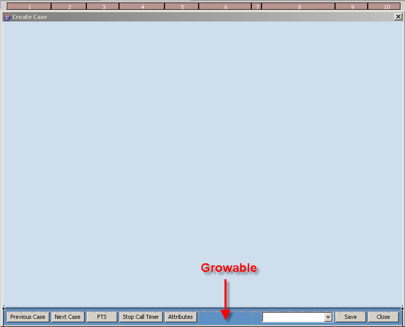
For the lower row buttons area, the new layout is simple: I redefined the panel’s (pnlButtonsMain) grid to contain a single row having a constant height of 22 pixels, and a horizontal strip of ten none-growable columns, each was set to have an initial constant width of 60 pixels (some width size were extended laters). One column (marked with red arrow) was set to growable, to allow the buttons strip to expand to full width of any form / screen size.

Next we need to place all relevant controls in their new locations. All relevant original buttons (those previously moved to ‘Unused Controls’) were moved back from the ‘unused controls’ area to their new locations on on pnlButtonsMain:

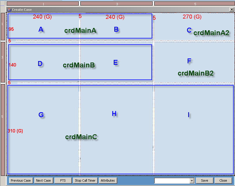
The upper, main area (pnlMain) was subdivided using the following 5 X 5 grid:

The numbers in red denote the column / row fixed size and an optional (G) whether they are growable.
Note the spacer rows (5 fixed pixels width / height) that initially leave nine real estate rectangle areas (areas A – I), each populated with its own card panel and one or more flipping panels attached to it (eventually, these nine areas are reduced to five dispayable areas).
The three main columns are growable and have similar stretching relative weight. The similar stretch weight guarantees they will evenly stretch within the size of their containing form.
Display Topics
Each area within these columns will be used to display one topic (group of related controls) per panel.
A card panel can display a single panel at a time or flip panels according to some business logic. Each panel practically displays a group of related controls (called topics).
The division to distinct areas provides a convenient, readable view, allowing the human eye to easily capture and grasp each topic’s content.

Reducing the Number of Display Areas
In order to reduce the number of topics, some adjacent areas were defined to share a single card panel (a card panel can occupy one or more neighboring areas). Thus areas A and B share the card panel crdMainA, areas D and E share crdMainB and areas G, H & I share crdMainC.
Placing the Controls
All card panels, except for cardMainC, currently relate with only one panel which is dispaled by default (in other words, they do not flip panels).
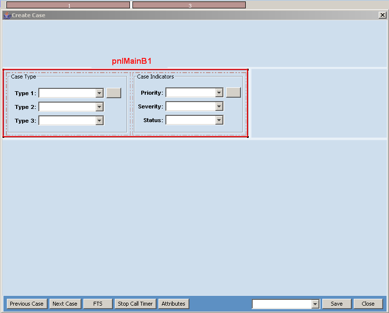
Let’s have a further look at cardMainB / pnlMainB1


The panel pnlMainB1 layout use a 1 X 3 grid; a single fixed 125 pixels height row, and two subareas, having 220 and 240 pixels width, separated by a 5 pixels devider. Each display area use its own panel: PnlMainB1Inner (Case Type) and pnlCaseIndicators (Case Indicators).

Each of these panels has its own grid layout i.e.: Case Type. Once the grid layout was defined, I was then able to move back the original UI elements from the unused controls to their new location.


As mentioned, the original logic still works with these controls; there is no need to write any new code for them.
Now let’s view the lower card panel crdMainC:
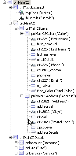
Under this card panel we find pnlMainC1 and pnlMainC2. Unlike the previous example, where the two subpanels were placed on a parent panel grid, each at its own space (therefore displayed together), here we find two panels directly located under a card panel. This layout allows only one of them to be displayed at a time (since both occupy whole parent card panel space).


Each of these panels further carries its own layout hierarchy to support exact layout.
We need now to add logic that will allow the application to respond to user selection and expose the panels, each at a time. In order to provide this interactive functionality, a hyperlink control was added at the upper right corner of each panel.
On pnlMainC1, a hyperlink labeled ‘Details’, on pnlMainC2, a hyperlink labeled ‘Notes’.
Clicking on the Details hyperlink should trigger the application to display pnlMainC2 and Clicking on the Notes hyperlink should trigger the application to display pnlMainC1.
First we had to associate an action – an action object that is invoked when a hyperlink is clicked – to each of these hyperlinks. We associated both hyperlinks with the selectTabPanels action

Here is the selectTabPanels action definition:

And here is the code associated with the action’s start event. This code is invoked when actions associated controls (the Details and Notes hyperlinks) are clicked:

Note that the actual control (hyperlink) that was clicked and triggered the event is identified out of the event data. The name of the panel to be displayed is retrieved from the user data associated with the clicked hyperlink. The User Data programmatically added to the control when the form is initialized:
")
The actual panel replacement performed by the updateControls() method:
")
There are numerous additional features that were added to the upgraded page but not described in this post due to space limits.
To watch the new form in action, click the following link Create Case.
Upgrading AmdocsCRM Smart Client Form (Part One)
Upgrading AmdocsCRM Smart Client form (Part One)
One of the common business requirement is to upgrade an out of the box form and either add more functionality or merely change its appearance to enhance the end user experience when interacting with this form. In the following example I shall illustrate how easy it is to make such enhancement.
I will show how a simple OOB (out of the box) form can be enhanced using form inheritance capability of the AmdocsCRM Smart Client.
I shall also demonstrate how user experience can be greatly enhanced by combining several separated forms into a single form by exploiting Java SWING panel elements.
Let’s look at an OOB Create Case form:

The above form was re-designed to provide better UI usability:
Re-designed Create Case:

Note that the entire UI arrangement was changed:
- Many unnecessary items were removed from initial screen (form) layout.
The screen is less crowded, more logically arranged for easier readability - Caller details were moved to the lower part of the form, since usually this information is automatically populated from the CIM (Customer Interaction Manager)
- Removed items remained accessible only when needed
- ‘Case type’, ‘Case Indicators’, ‘parent-child’ and ‘contract’ were re-arranged vertically for easier human eye capture.
- All buttons were moved to the lower part of the screen
- The lower part of the form is used in three different ways:
– The default form (displayed above)
– Clicking the +/- (shown in red circle) expands the notes field to capture the full lower part space:

– Clicking the ‘Details’ link replaces completely the lower part of the screen to reveal other items which previously occupied expensive portions on the main form;

– Clicking the ‘Notes’ hyperlink takes the user back to display the ‘Notes’ again, either in their short or expanded form.
Customizing a New Layout
The new layout was achieved without changing the original (out of the box) logic, but merely adding minimal code to support the enhanced appearance.
The necessary steps to re-arrange an OOB form are:
- Create a new Smart Client project in your Eclipse Smart Client Designer IDE.
Make sure to include AmdocsCRMSource.jar in the project’s class path. - Using the Eclipse package explorer, identify the original (out of the box) form’s package name (com.amdocs.crm.isupport.kcase) and full Logical Form Name (LFN) com.amdocs.crm.isupport.kcase.casecreate in the jar file AmdocsCRMSource.jar.

3. Open the selected form’s layout (right click the OOB form’s name ‘CaseCreate.uiff’ and select ‘Open’)
4. Click the ‘Derive Form’ button

to open the form inheritance dialog:

Note that the base form full logical name (package + form name) is already
selected and can not be changed (marked in red ellipse): com.amdocs.crm.isupport.kcase.CaseCreate
5. Fill the necessary parameters in the New Derived Form dialog:
Source Folder: Browse to the source folder in your project.
Package: This should be your customized package name.
It is a good convention to keep the original package name structure,
however, replace the company name part with your company name.
Thus, our package name will be com.nextgen.crm.isupport.kcase
Form Name: It is a good practice to use same name as the original, adding an ‘X1’
prefix to emphasize the customization level: X1CaseCreate
(next inheritance layer for this form will use X2CaseCreate etc).
Design Notes: Add a short description for your customization.
6. Click ‘Finish’.
7. Look at your source folder in your project at the package explorer:

8. A new package was added, plus four files that represent your newly inherited form:
- X1CaseCreate.java – new java class file, which extends the original OOB form
logic. You may leave this form as is (no additional code), override methods or members in the original class, or add your new logic here. - X1CaseCreate_en_US.properties and X1CaseCreate_en.properties
resource bundle files that stores all your localized strings. - X1CaseCreate.uiff – an xml file that extends the original CaseCreate.uiff xml file.
the .uiff is an XML file which defines the UI layout and form related dataset.
9. In order to direct the application to use our inherited form at run-time, we need to define a version selector object. A version selector is an xml file that must have similar Logical File Name (original package and form name) of the form we are about to override. The version selector file allow defining an expression that evaluates in memory application values at run time (usually they represent cached database field value i.e. login_name = ‘yuvalr’) and a target Logical File Name that represent the form to use if the expression evaluated to ‘true’.
A version selector may contain several entries of expressions – LFNs (they are evaluated until one evaluates to ‘true’.
- We shall create a new package in our source folder. The new package name should be exactly as the original OOB form package: com.amdocs.crm.isupport.kcase


Under our new package we define the following XML file: CaseCreate.uifvs
<?xml version=”1.0″ encoding=”ASCII”?>
<VersionSelection designerVersion=”7.5″>
<Rows>
<Version
exprDescription=”Default Version”
expression=””
physicalName=”com.nextgen.crm.isupport.kcase.X1CaseCreate”
type=”form”/>
</Rows>
</VersionSelection>
In the package Explorer it looks like this:

Note the following;
- The version selector file should be named exactly as the original inherited form name.
- The version selector file should be located at package which has exactly the same as the original (inherited) package name.
- The package should reside in our project source folder
- Our version selector file contains only a single ‘default’ row, which includes:
- Version description
exprDescription=”Default Version” - An empty expression (empty expression always defaults to true).
expression=”” - A target phisical target file name “com.nextgen.crm.isupport.kcase.X1CaseCreate”
- Version description
At runtime, when the application looks for the original form, a version selector mapping class is evaluated (remember: the version selector has similar name and package as the original form).
Since its default entry (row) is always evaluated to true, the application use our inherited physical target form (X1CaseCreate).
- We still need to make sure that the application finds our version selector before it finds the original form, otherwise the original form will be used and the application will never be able to evaluate our version selector.
To make sure the version selector is used before the original form, we need to set the project’s class order in a way that it looks for our customizations (source folder) before the original oob class (located in AmdocsCRMSource.jar).
- We open our project’s properties dialog and select the ‘Order and Export’ tab:


Note that the .uifgenjava folder contains the final source code. This ‘final’ source is automatically created by an application generator utility. It is then build, complied and run.
10. Now it is time to see if our inherited form indeed used by the application;
we shall add a form event handler. We use the ‘form_load’ event handler and add our own code in its stub to print our inherited form name to the console.
11. Double click X1CaseCreate.uiff.
The default view tab (designer) displays the inherited UI layout – it still looks like the original form:

- On the ‘Controls’ UI layout pane, select the ‘Form’
- On the lower ‘Properties’ pane, select the ‘Events’ tab – it shows available form events. Select the selection icon in the ‘value’ column. The Application Code Editor is opened and displays the ‘form_load’ event handler stub that is automatically added to our inherited class.
- We add to the ‘form_load’ event handler the following line of code:
System.out.println(“… X1CaseCreate …”);

12. Let’s run the application and try to create a Case.

If our form is used, the console should display the text
‘… X1CaseCreate …’

Indeed – our inherited form is now invoked.
13. Now it is time to modify the layout.
In the UI designer view, we first move all main panel components to the unused controls area;


If we run the application now and try to create a new Case, an empty form will be displayed.
14. Now it is time to modify the layout.
First we change the root panel into two main sections:
- Main form area
- Lower buttons area


We now add two card panels (crdMain and crdButtons) under root, one for each main area:

Within each of the card panes we add a panel (pnlMain and pnlButtonsMain)
A ‘Card Panel’ allows adding several panels underneath. Only one panel can be displayed under a Card panel at a time.
This capability will allow us in future to expand functionality at a will, by adding more panels and swap them as necessary. Currently we use only one default panel under each card.
(To be continued. )
About
Welcome to NextGen Consulting.
We provide IT consulting services to organizations that use either Microsoft Dynamics 365 or Amdocs CRM (or legacy Clarify) platforms.
Having over 17 years with full life cycle of CRM projects (Dynamics 365 / Power Apps, Amdocs CRM / Clarify), broad enterprise and telecom industry knowledge, in-depth experience with OSS / BSS, CRM, Service Assurance, Marketing and Sales business processes, we offer flexible variety of services aimed at both the telecom and the enterprise organizations such as:
- Provide complete turn-key solutions ( Amdocs Smart, Thin, Classic clients, Microsoft Dynamics CRM)
- Subcontract Design and development
- High level business design and documentation
- Detailed level technical design and documentation
- Develop design to a deliverable solution using agile methodologies
- Improve user experience (UI design and implementation)
- Design and Development Management
- Create user workshops for business analysis and requirements gathering
- Provide training for developers and business users
- Design complete solution architecture
- Inspect external provider deliverables
Our people have hands-on implementation expertise with implementing various business processes using rich selection of front end technologies such as Microsoft Dynamics CRM and Amdocs CRM (Smart Client, thin client, and Clarify Classic Client).
We can use this expertise to help your organization migrate existing legacy application to a newer platform, or simply provide any level of design (high level, low-level) and implementation to fit your organization needs.
Join our LinkedIn Smart Client Group to get immediate updates and share your ideas, needs and comments.
See more on Yuval Rashelbach.
For further information view profile at http://il.linkedin.com/in/yuvalr
or contact Yuval Rashelbach at yuval.rashelbach@nextgencon.com
 NextGen Consulting