Upgrading AmdocsCRM Smart Client form (Part Two)
Preface
The original out of the box AmdocsCRM application quite often contains forms which deliver none-optimized user experience; these forms display too much information and lack context sensitive functionality. For certain business scenarios part of the displayed information is either irrelevant or overloaded.
These forms do not take full advantage of the rich client capability provided by the Smart Client underlying Java SWING technology.
In this two part posts I try to demonstrate how the SWING technology can vastly enhance user experience and improve usability by merely rearranging form layout and adding simple logic to it.
In part one I have demonstrated the first steps in upgrading an original, out of the box, Smart Client create case form.
I created an inherited version of the original form, created a form version selector to redirect the application to the newly created inherited form, verified the inherited form, then started to rebuild the new version by first moving all original controls to a parking lot (the ‘Unused Controls’ area), and rearranged the form layout.
Note that all the logic provided with the original form (dataset, code) is still active in the new form, but since all original controls are invisible (moved to the unused controls), I can invoke the new form but can not interact with it yet due to the hidden controls.
A new grid was defined for the root panel: One column and two rows. The single column has a predefined width size (initial form width size of 800 pixels) and will stretch itself (‘growable’) to allow it expand to the full screen width.
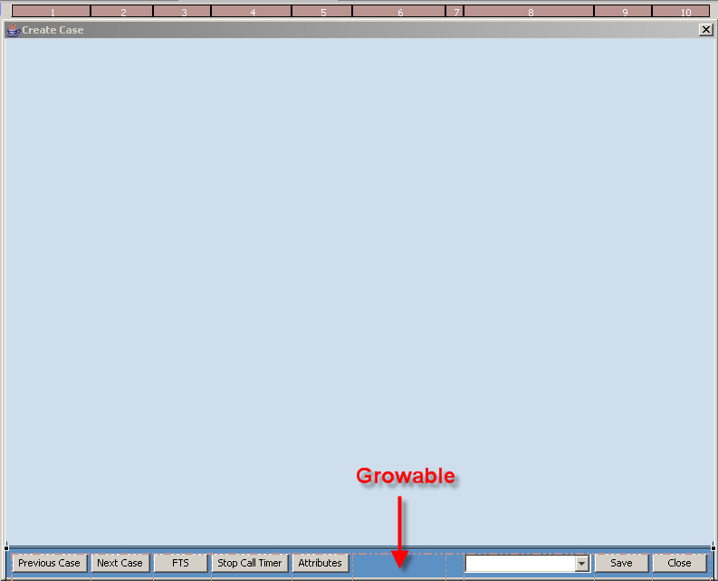
Assuming the minimal form height is 600 pixels, the first row was defined to an initial constant height of 555 pixels and growable to provide space for the main form area, while the lower row was defined as a fixed (none growable) 33 pixels height to provide exact space to contain the form’s buttons.
Each of the two rows was populated with a card panel UI control on which second level panels may be added. This gives the flexibility to add several fully overlapped panels under the card panel. Each of these panels can later expose different sets of controls according to the business process context. This paradigm allows for enhanced user experience by exposing only context relevant information at a time. This time we placed only a single panel under each card: crdMain / pnlMain for the main area and crdButtons / pnlButtonsMain for the lower row.
For the lower row buttons area, the new layout is simple: I redefined the panel’s (pnlButtonsMain) grid to contain a single row having a constant height of 22 pixels, and a horizontal strip of ten none-growable columns, each was set to have an initial constant width of 60 pixels (some width size were extended laters). One column (marked with red arrow) was set to growable, to allow the buttons strip to expand to full width of any form / screen size.

Next we need to place all relevant controls in their new locations. All relevant original buttons (those previously moved to ‘Unused Controls’) were moved back from the ‘unused controls’ area to their new locations on on pnlButtonsMain:

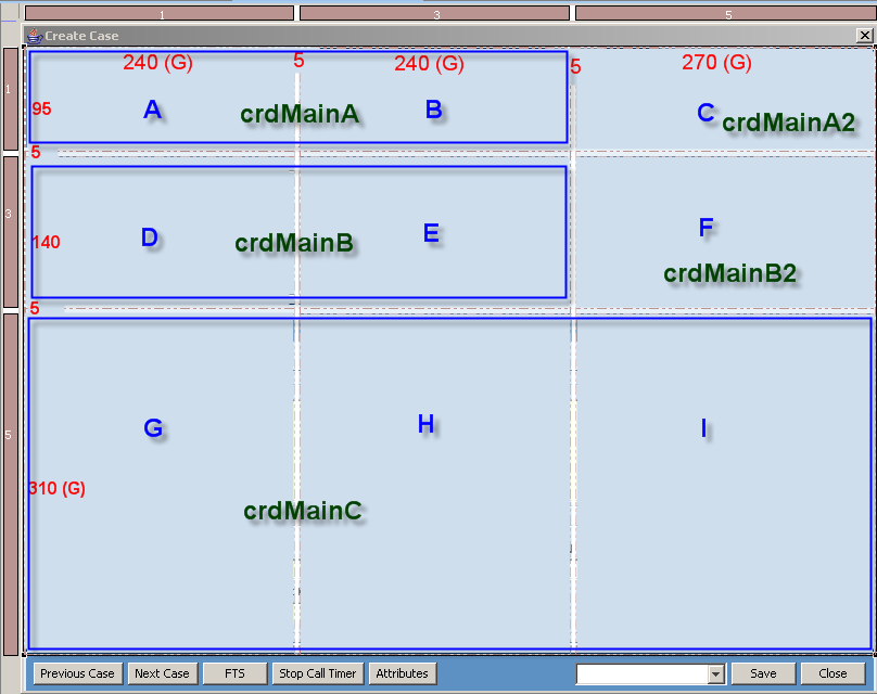
The upper, main area (pnlMain) was subdivided using the following 5 X 5 grid:

The numbers in red denote the column / row fixed size and an optional (G) whether they are growable.
Note the spacer rows (5 fixed pixels width / height) that initially leave nine real estate rectangle areas (areas A – I), each populated with its own card panel and one or more flipping panels attached to it (eventually, these nine areas are reduced to five dispayable areas).
The three main columns are growable and have similar stretching relative weight. The similar stretch weight guarantees they will evenly stretch within the size of their containing form.
Display Topics
Each area within these columns will be used to display one topic (group of related controls) per panel.
A card panel can display a single panel at a time or flip panels according to some business logic. Each panel practically displays a group of related controls (called topics).
The division to distinct areas provides a convenient, readable view, allowing the human eye to easily capture and grasp each topic’s content.

Reducing the Number of Display Areas
In order to reduce the number of topics, some adjacent areas were defined to share a single card panel (a card panel can occupy one or more neighboring areas). Thus areas A and B share the card panel crdMainA, areas D and E share crdMainB and areas G, H & I share crdMainC.
Placing the Controls
All card panels, except for cardMainC, currently relate with only one panel which is dispaled by default (in other words, they do not flip panels).
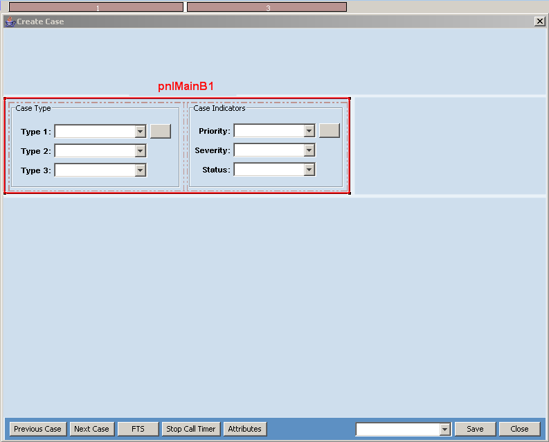
Let’s have a further look at cardMainB / pnlMainB1


The panel pnlMainB1 layout use a 1 X 3 grid; a single fixed 125 pixels height row, and two subareas, having 220 and 240 pixels width, separated by a 5 pixels devider. Each display area use its own panel: PnlMainB1Inner (Case Type) and pnlCaseIndicators (Case Indicators).

Each of these panels has its own grid layout i.e.: Case Type. Once the grid layout was defined, I was then able to move back the original UI elements from the unused controls to their new location.


As mentioned, the original logic still works with these controls; there is no need to write any new code for them.
Now let’s view the lower card panel crdMainC:
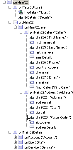
Under this card panel we find pnlMainC1 and pnlMainC2. Unlike the previous example, where the two subpanels were placed on a parent panel grid, each at its own space (therefore displayed together), here we find two panels directly located under a card panel. This layout allows only one of them to be displayed at a time (since both occupy whole parent card panel space).


Each of these panels further carries its own layout hierarchy to support exact layout.
We need now to add logic that will allow the application to respond to user selection and expose the panels, each at a time. In order to provide this interactive functionality, a hyperlink control was added at the upper right corner of each panel.
On pnlMainC1, a hyperlink labeled ‘Details’, on pnlMainC2, a hyperlink labeled ‘Notes’.
Clicking on the Details hyperlink should trigger the application to display pnlMainC2 and Clicking on the Notes hyperlink should trigger the application to display pnlMainC1.
First we had to associate an action – an action object that is invoked when a hyperlink is clicked – to each of these hyperlinks. We associated both hyperlinks with the selectTabPanels action

Here is the selectTabPanels action definition:

And here is the code associated with the action’s start event. This code is invoked when actions associated controls (the Details and Notes hyperlinks) are clicked:

Note that the actual control (hyperlink) that was clicked and triggered the event is identified out of the event data. The name of the panel to be displayed is retrieved from the user data associated with the clicked hyperlink. The User Data programmatically added to the control when the form is initialized:
")
The actual panel replacement performed by the updateControls() method:
")
There are numerous additional features that were added to the upgraded page but not described in this post due to space limits.
To watch the new form in action, click the following link Create Case.
7 Comments »
Leave a reply to quantran Cancel reply
About
Welcome to NextGen Consulting.
We provide IT consulting services to organizations that use either Microsoft Dynamics 365 or Amdocs CRM (or legacy Clarify) platforms.
Having over 17 years with full life cycle of CRM projects (Dynamics 365 / Power Apps, Amdocs CRM / Clarify), broad enterprise and telecom industry knowledge, in-depth experience with OSS / BSS, CRM, Service Assurance, Marketing and Sales business processes, we offer flexible variety of services aimed at both the telecom and the enterprise organizations such as:
- Provide complete turn-key solutions ( Amdocs Smart, Thin, Classic clients, Microsoft Dynamics CRM)
- Subcontract Design and development
- High level business design and documentation
- Detailed level technical design and documentation
- Develop design to a deliverable solution using agile methodologies
- Improve user experience (UI design and implementation)
- Design and Development Management
- Create user workshops for business analysis and requirements gathering
- Provide training for developers and business users
- Design complete solution architecture
- Inspect external provider deliverables
Our people have hands-on implementation expertise with implementing various business processes using rich selection of front end technologies such as Microsoft Dynamics CRM and Amdocs CRM (Smart Client, thin client, and Clarify Classic Client).
We can use this expertise to help your organization migrate existing legacy application to a newer platform, or simply provide any level of design (high level, low-level) and implementation to fit your organization needs.
Join our LinkedIn Smart Client Group to get immediate updates and share your ideas, needs and comments.
See more on Yuval Rashelbach.
For further information view profile at http://il.linkedin.com/in/yuvalr
or contact Yuval Rashelbach at yuval.rashelbach@nextgencon.com
 NextGen Consulting
[…] (To be continued. ) […]
Hi Yuval,
Thanks for sharing the information.
I currently work on Classic Client and with above information got some information on smart client.
Thanks,
Rajesh
Hi Yuval
I want to set the style for Search Grid control, but I don’t know how set it?
Could you tell me to set the style for Search Grid controls?
for example
Set the width of columns, scroll…
Many thanks
Quan
Setting Search Grid Properties
Question:
Hi Yuval
I want to set the style for Search Grid control, but I don’t know how set it?
Could you tell me to set the style for Search Grid controls?
for example
Set the width of columns, scroll…
Many thanks
Quan
Answer
General Grid properties set the overall Grid control behavior. For example:
autoResizeMode – Sets the auto resize mode of a grid.
gridColumnSequence – Sets the column sequence by the input column name order, the column sequence is an ordered collection of column names. The order of this collection represents the order of columns in a grid like display. The column orientation, either from left to right or from right to left depends on the end users locale setting. The column order string is delimited by comma.
preferredRows – Sets the preferred height of the control in logical units. In other words, define Setting the value to -1 restores the default behavior.
Scrolling will be set according to the number of records provided in the Display Tabular Data Model (TDM) versus the grid height. If the number if the total height of rows to be displayed is larger than the Grids height – then scroll bars will be displayed (you can limit the number of retrieved records from the database by setting the application’s workspace variable gridDefaultNumRequested to your preferred capacity (the default is 20).
Each Search Grid (or any simple grid) column is directly related with a UI control (I.e. label, textbox or a dropdown). The column’s control properties set the column rendering attributes such as column width etc.
When setting Grid’s column controls properties, note that within the column main properties, you will find a property named ‘control’. This ‘control’ can be expanded to reveal a group of sub-properties.
Both types of properties set the way the column will be displayed. However, note the difference behavior impact between ‘main’ properties and ‘control’ properties which have similar name.
For example, assuming we need to display a three columns Grid. We need to add three Label controls under the Grid control (drag 3 label controls and drop them under the Grid control).
The following label column ‘main’ properties will set the following behavior:
Title – Column title
columnSpan – Indicates by how many columns this column is to be spanned.
Value 1 or 0 means no span.
Value of -1 means span the whole row.
Visible Sets the visibility of the entire column space:
When set to false the whole column space is removed (our example grid will show only two columns).
The following are ‘Control’ properties:
horizontalAlignment – Sets the horizontal alignment of the (optional) icon and text.
horizontalTextPosition – Sets the horizontal position of the text relative to the icon.
preferredColumns – Sets the column width.
Setting the value to -1 restores the default behavior (defined by grid’s property).
Visible Sets the visibility of the column contents. Does not remove column space
When set to false the column space remains in Grid (our example grid will show three columns), but column content will be empty.
For complete list of properties, follow the Smart Client designer properties tooltips, or read programmer’s documentation.
Look and Feel
Smart Client Framework also provides a Look and Feel control using Style sheet. This sets the UI controls appearance on the screen. The style sheet defines styles, each style group set of display attributes. In order to apply a style to specific Grid, the Grid’s style property needs to be set to the style name.
The following L&F style attributes can be applied on a Grid:
Border The border for a search grid is applied around the table, including the column titles. It does not surround the search grid header (the area containing the Search Now button etc.). In order to set a border around the entire search grid, place the search grid in a panel and apply the desired border to that panel.
alternateRow A 24-bit number; 3 X 8 bits RGB components I.e.: Red -> 0xff0000
Used to paint row’s background alternately between table’s background color and the specified alternate backgroundColor.
rowHeight Row height in pixels. I.e.: 18
gridColor Color a 24-bit number; 3 X 8 bits RGB components I.e.: Red -> 0xff0000
showGrid Boolean true or false
showHorizontalLines Boolean true or false
showVerticalLines Boolean true or false
backgroundSelectionColor Color 3 X 8 bits RGB components I.e.: Red -> 0xff0000
textSelectionColor Color a 24-bit number; 3 X 8 bits RGB components I.e.: Red -> 0xff0000
backgroundHighlightColor Color a 24-bit number; 3 X 8 bits RGB components I.e.: Red -> 0xff0000
textHighlightColor Color a 24-bit number; 3 X 8 bits RGB components I.e.: Red -> 0xff0000
focusBorderColor Color a 24-bit number 3 X 8 bits RGB components I.e.: Red -> 0xff0000
Many thanks Yuval R, it is useful for me
Dear Yuval
In SearchGrid Control, I want to write “double click” event but I ditn’t search this event in Search Grid’properties
Could I tell me to show about this event?
Many thanks
Giang
Double click event is implemented in the Search Grid (or simple Grid) using activationAction event handler.
The activationAction sets the action to be launched when a cell in a row is double clicked. This action is executed if and only if the cell is not editable and the corresponding column control of the cell is not an action control (hyperlink or button).
See Implementing Double Click event in Search Grid for step by step details.